THE HISTORY OF OUR LAKES EAGLES LOGO
The original Lakes Community High School logo was created in the months before the school opened in 2004. A committee made up of students, parents, and school personnel chose the design from many submitted by community members.
The original logo is made up of two main elements: the word “Lakes” in royal blue script outlined in red, and the eagle. The typeface used for “Community High School” is Schoolbook Bold.
Between 2004 to 2012, these two elements were used for most branding of Lakes Community High School. The full logo is still represented on the north wall of the main gymnasium as a mural where the eagle is breaking through bricks to land on the “Community High School” text.
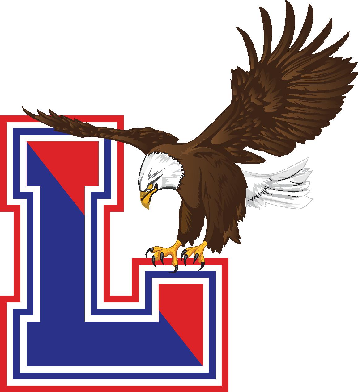
Placing this large of a logo on a t-shirt became a challenge even from the day the doors opened in 2004. This led to most t-shirts and small items needing economical branding. Most of these items would get a small “L” with a small version of the eagle landing on the “L,” which is shown below.

Northern Lake County Conference. The artwork provided to the NLCC was the original eagle. At the beginning of the 2016-2017 school year, the combination of the gym floor logo and the eagle became the official Lakes Community High School logo for all branding purposes.
